Description
Boost is a service to save time by pre-ordering meals, snacks, and drinks from your campus, on your browser or with our mobile app.
Website
Background
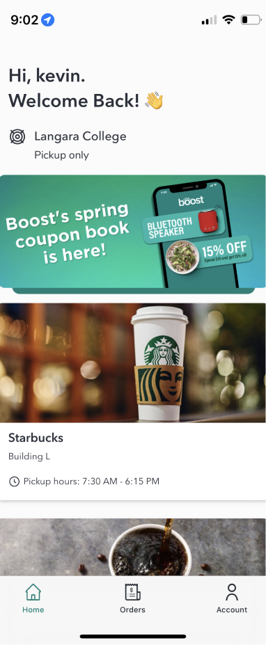
The Boost redesign project aims to improve and fix several UI/UX problems found in their mobile application. The elements updated were the home screen, the store screen, and UI kit. The main goal of this project was to improve the user experience and the user interface of the application.
Typography
The combination of Komet with Source Sans Pro generates highly readable content. Moreover, the boldness and slight curves of Komet work perfectly with the firm and refined glyphs of Source Sans Pro create, generating interest in the design.


Iconography
To improve the contrast in the menu, I decided to use line icons for menu items as default and glyph-type icons for the active menu.
I changed the iconography for the material design because of the cleanness and simplicity of their design.
Colour Pallete
I kept the primary colours of the brand; however, I included the orange as an accent to enhance the contrast and focal point of the call to action.
Primary
Accent
Secondary
Black
Dark Gray
Gray
Light Gray
Components
I tried to maintain a clean and simple design through all the components. Using rounded corners to get a friendly approach and light lines to keep the focus on the information.


Home screen redesign
Improvements
- Add header at the beginning of the page, this new section includes the location and a search bar. The lack of searching affects directly the experience of the users.
- Enhance the welcome message by adding a gradient.
- Enhance readability by adding icons to labels.

Store screen redesign
Improvements
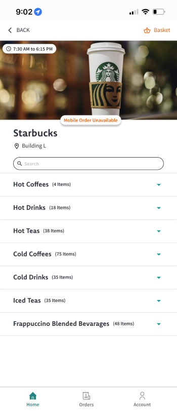
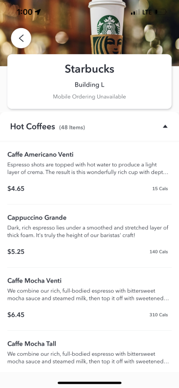
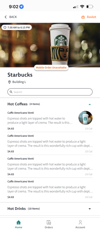
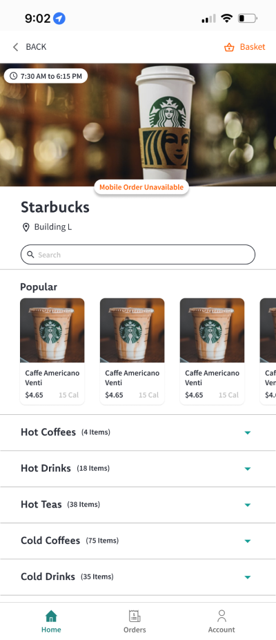
- Improve the use of negative space by adding dividers and updating the list style
- Add a top header that contains the back button and the basket button.
- Add contrast to the current status of the store by moving the label and using the accent colour.
- Include Search bar features and popular list to enhance the user experience.
- Include images for the list items.

